AX1836
Grid properties define the available features and the overall presentation of data in a web report. Using the grid properties, you can configure:
- User interaction properties, such as whether users can filter columns, sort columns, and reorder columns.
- Display properties, such as whether the grid has a total row and whether rows with all zero values display.
- Drilling properties, such as what type of drilling is enabled and configuration for directed drilling.
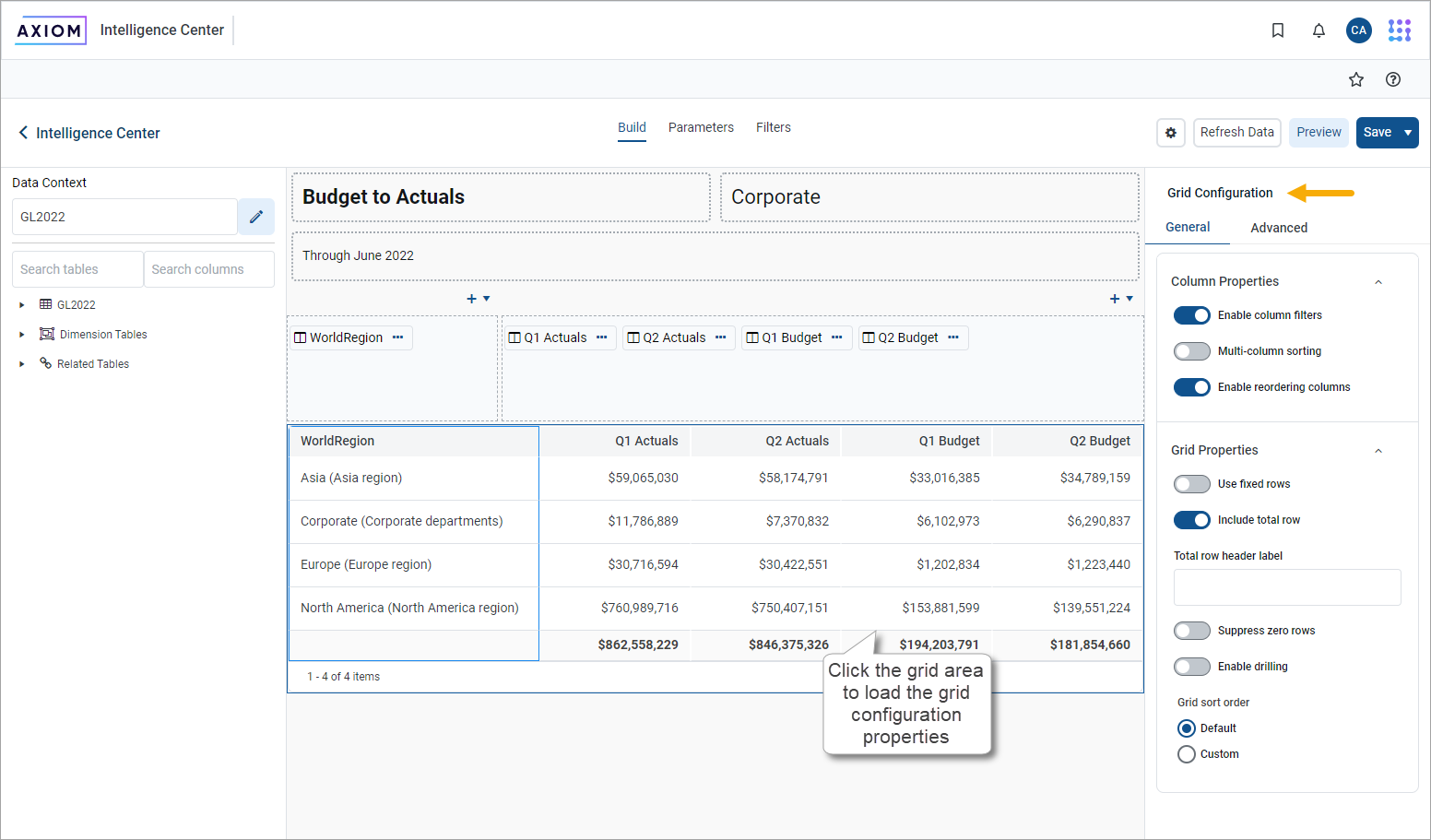
In the Report Builder, the grid properties are defined in the right Configuration Panel.
-
On the Build tab of the Report Builder, in the report canvas, click the grid that appears below the column setup boxes.
-
In the right configuration pane, complete the Grid Configuration properties, as needed.
The grid configuration properties are separated into two tabs:
- General: Basic grid properties to review and configure for all web reports.
- Advanced: Advanced grid properties, such as default column formats for the grid.
General grid properties
The following grid properties are available for web reports on the General tab of the Grid Configuration pane:
Column properties
| Item | Description |
|---|---|
|
Enable column filters |
Specifies whether users can filter columns in the grid. Only applies to grids with dynamic rows; users cannot filter columns in grids where Use fixed rows is enabled.
|
|
Multi column sorting |
Specifies whether users can sort by multiple columns in the grid. Only applies to grids with dynamic rows; users cannot filter columns in grids where Use fixed rows is enabled.
Users can sort columns by clicking the column header. Each click toggles through sort ascending, sort descending, and no sort. NOTE: Clearing the sort is only available if multi-column sorting is enabled. Otherwise, clicking a column header toggles between sort ascending and sort descending. You can click a different column header to sort by that column, but you cannot clear the sort. |
|
Enable reordering columns |
Specifies whether users can reorder columns in the grid.
|
Grid properties
| Item | Description |
|---|---|
|
Use fixed rows |
Specifies whether the grid uses dynamic rows or a fixed row structure.
|
| Fixed row structure |
Specifies the fixed row structure to use in the grid. Only applies when you enable Use fixed rows. Select an existing fixed row structure to define the rows of the grid. You can enter text in the box to filter the list of fixed row structures by name. Create fixed row structures from the Intelligence Center. For more information about creating fixed row structures, see Manage fixed row structures for web reports. |
|
Include total row |
Specifies whether a total row exists on the grid. Only applies to grids with dynamic rows; if Use fixed rows is enabled, the grid uses subtotal and total rows as defined in the fixed row structure.
|
|
Suppress zero rows |
Optional. Specifies whether data rows with all zeros are suppressed from appearing in the grid. Only applies to grids with dynamic rows; all zero rows cannot be suppressed in grids where Use fixed rows is enabled. Non-key columns that meet both of the following criteria are evaluated to determine whether a row should be hidden:
If the primary table is a data table, Integer and Numeric columns on lookup reference tables are ignored—meaning these columns may have values but the row is still suppressed if all applicable data table columns have zero values. There is one exception: reference table columns are considered if the column classification is Values and the numeric type is Currency. Calculated columns defined in the grid are not evaluated for this purpose and do not prevent a row from being suppressed. |
|
Enable drilling |
Specifies whether users can drill down rows in the grid to view the underlying data.
|
|
Grid sort order |
Specifies the sort order for data in the grid.
If a custom sort is specified but no columns are added to the sorting configuration, the grid reverts to using the default sort order. NOTE:
• If Multi column sorting is not enabled for the grid, the grid still honors a multi-column sort configuration when the report is initially rendered. However, if a user sorts by any column, the grid reverts to single-column sorting and does not return to the previous sort configuration other than by reloading the report. • You cannot add process columns as custom sort columns. • If you add a dynamic column to the sort configuration, it appears in the list with its assigned Column List report parameter name in parentheses. If you hover your cursor over the column name in the sort configuration, the current column used by the dynamic column appears in the tooltip. |
Advanced grid properties
Using the properties on the Advanced tab of the Grid Configuration pane, you can view and edit Default column formats for columns in the current report. Select a column Data type that you want to configure and this section populates with the properties for the selected data type.
All columns added to the report inherit the settings defined here. By default, columns continue to inherit any changes made to the default column formats unless the format has been overridden at the column level.
For example, the default alignment for String columns is Left. When String columns are added to the grid, they are configured to use the Default alignment, meaning Left. If preferred, you can change the default alignment for String columns to Center, and all String columns in the grid that are using the Default alignment will now update to use Center alignment. However, if you have manually configured a particular String column to use Right alignment instead of the Default alignment, that column continues to use its configured alignment of Right.
| Item | Description |
|---|---|
|
Data type |
Select a column data type to view and edit the default column formats for that type. The following data types are available:
Additionally, when you create a calculated column, you can specify its data type as one of the numeric data types. The column then uses the default column formats for that data type. The default data type for calculated columns is Currency. NOTE: Columns that would normally be treated as Number data type are treated as Dimension data type if they are used as row dimension columns or drill columns. |
|
Column width |
The default column width for the selected Data Type in pixels. Enter the preferred column width as a whole integer between 30 and 600. The default width for each data type is as follows:
|
|
Alignment |
The default alignment of the column values for the selected Data Type. If you want to change the default alignment for a data type, select one of the following: Left, Right, Center. The default alignment for each data type is:
|
Numeric default properties
The following default properties only appear if the selected Data type is a numeric data type. Use these properties to define the default numeric format by column data type.
For example, the default number format for the Currency data type uses zero decimal places, with a thousands separator, and a negative number format of red parentheses. When you add a Currency column to the grid, the contents automatically appear using this number format. If preferred, change the default number format for Currency so that it uses two decimal places and all Currency columns in the grid update to show two decimal places. This applies to columns that use the Currency number format by default, as well as columns that you have manually configured to use the Currency format. However, if you have manually configured a particular Currency column so that it now uses a Custom number format instead of the Currency number format, it continues to use its custom configuration.
| Item | Description |
|---|---|
|
Decimal places |
The number of decimal places used by the selected Data Type. Enter any whole number from 0 to 10. You can also use the arrow keys to move the number up or down. The default number of decimal places for each numeric data type is:
The Number data type does not use decimals. |
|
Use 1000's separator |
Specifies whether the selected Data Type uses a thousands separator:
|
|
Negative number format |
The format used by the selected Data Type to show negative numbers. Select the preferred format from the dropdown. Available formats use the minus sign, or parentheses, or red text (or a combination of these formats). The default negative number format for each numeric data type is:
|
Date and Date Time default properties
The following default properties only appear if the selected Data type is a date data type. Use these properties to define the default date format by column data type.
For example, the default format for Date columns is Month/Day/Year (such as "10/152023"). When you add a Date column to the grid, the contents automatically appear using this format. If preferred, change the default format for Date so that it appears as "October 15, 2023" instead, and all Date columns in the grid update to use this format. However, if you have manually configured a particular Date column so that it uses a different date format instead of the default format, it continues to use its custom configuration.
| Item | Description |
|---|---|
|
Date format or Date Time format |
The format used by the selected Data Type to show date or date-time values. Select any of the full date formats supported by Date and DateTime columns, including custom formats. By default, the formats are:
NOTE: Only full date formats are supported as the default format. If you configure an individual Date or DateTime column to use a different date part, such as Year or Quarter, the default date format no longer applies, and the column is treated as a Dimension data type. |
|
Custom Date format or Custom Date Time format |
Use this field to define the custom date or date-time format, if Custom is specified as the Date format or Date Time format. For more information about the syntax to define custom date and date-time formats, see Custom formats. |
Frequently asked questions
Can I disable paging for a dynamic row grid?
If the grid uses dynamic rows, it is automatically paged if it exceeds 25 rows. You cannot disable this paging.
How do I define a grid-level filter to limit the data in the report?
To filter the data in the grid, define a report-level filter. Select the Filters tab of the Report Builder to define one or more report-level filters.
