Productivity visualization
Use Productivity visualization to view biweekly productivity at a high level. Using the visualization, you can analyze the data in a variety of ways, including drilling on graphs and tables.
-
Select which data to explore and at what level.
-
View in-depth data by drilling on data points.
-
View a summary of productivity, see details at the department level, and analyze trends.
NOTE: Before you can view a visualization, you must process the data model on which the report is based. All calculations in the Productivity visualization are performed in the data model.
-
In the Web Client, go to the Intelligence Center.
-
In the Reports column, click the Productivity VI folder.
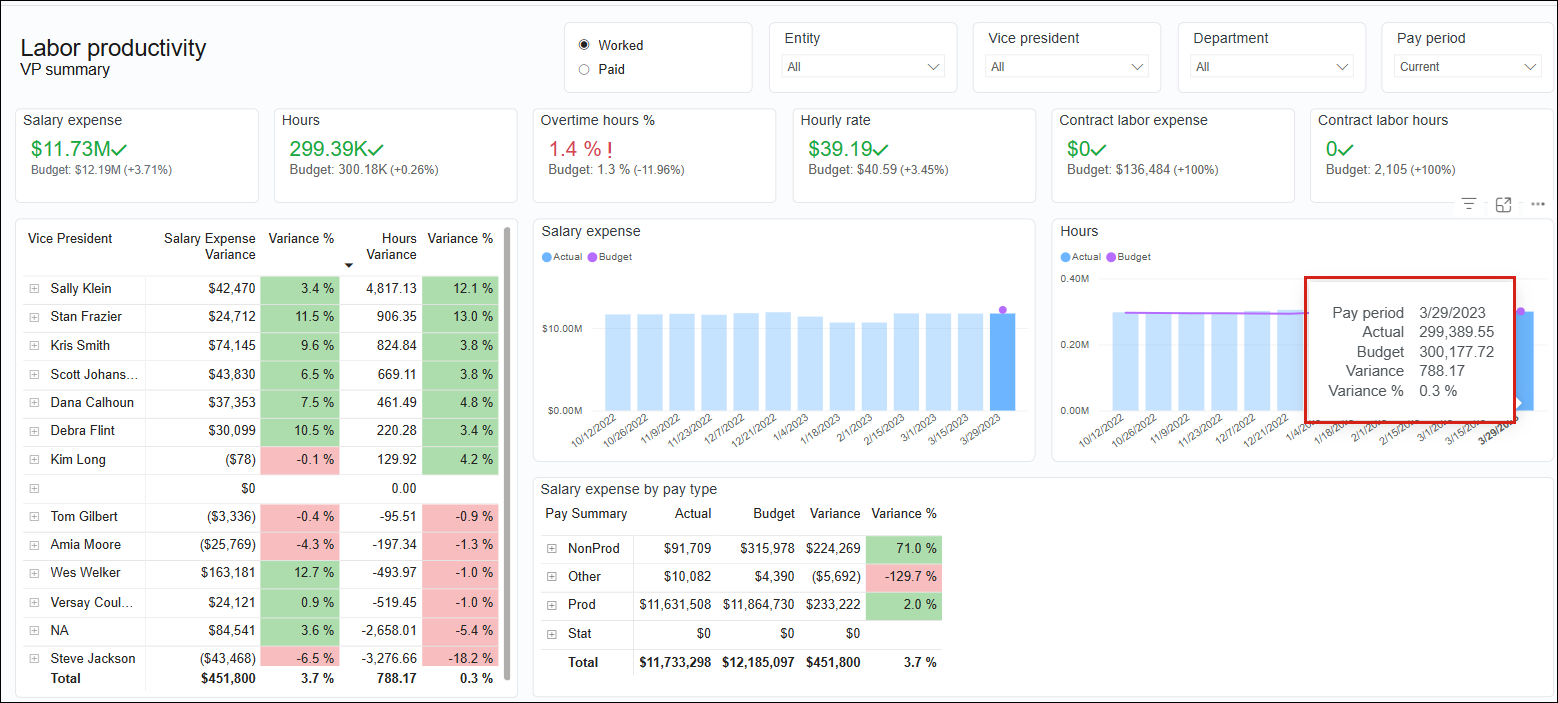
The following example of the Summary report tab provides an overview of the report’s main areas.
| Feature | Description |
|---|---|
| Report Settings and Filter Library icons | Customize the report, save, and apply filters. |
| Slicers |
Special filters for narrowing report data to the options selected from the following categories:
These slicers appear at the top of every tab in the report. Slicers are synchronized so that selections on one tab change data on the remaining tabs. You can make multiple selections from a slicer menu by pressing Ctrl while making selections. |
| Filters panel | Expand this panel to search for filters and create filters for your visualizations. |
| Report content | Reports can contain interactive graphs, KPI cards, and tables. |
| Tooltips | Hover over graphs, matrices, and tables to reveal relevant details contained in the report. |
| Reports tabs |
Contain report data specific to the tab’s category. |
Learn more about Productivity visualization:
Data slicer options
Use the slicer menus at the top of the page to select one or more data slices to include in the visualization:
- Worked vs Paid toggle
- Entity
- Vice President
- Department
- Pay Period
NOTE: Your security permissions determine the available options on the data slicer dropdowns.
These data filters appear on each tab of the report. Selections you make from filters on one tab are repeated on all other tabs to easily view how your selections affect all data categories in the report.
The graphs and amounts automatically adjust to your selections.
- For most filters, All is selected by default.
- To select an individual item, click the item.
- To select more than one item, press and hold down the Ctrl key while making your selections.
Tooltips
Productivity visualization uses two types of tooltips:
- On graphs that show Actual, Budget, Variance, and Variance Percent for biweekly data.
- On matrices and tables that show biweekly data.
Report security
Permissions for viewing the Productivity visualization depend on your user role and the data tables to which you have permissions. For example, you need permissions to view Payroll data. The Administrator uses the Security Manager to add users to roles. Refer to Manage users and roles and related topics under Security.
